Milton Fitness Centre Redesign
point of sale material
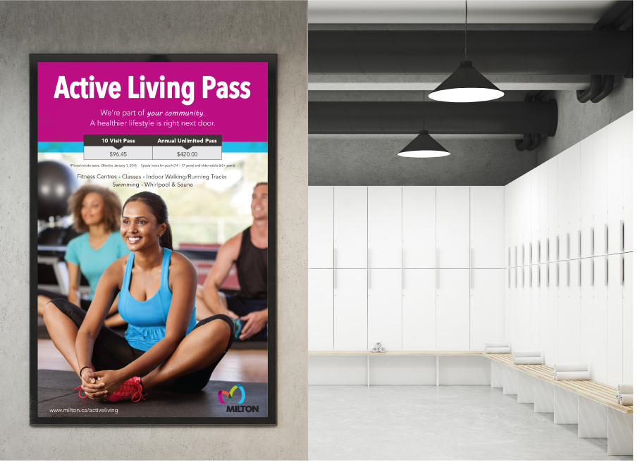
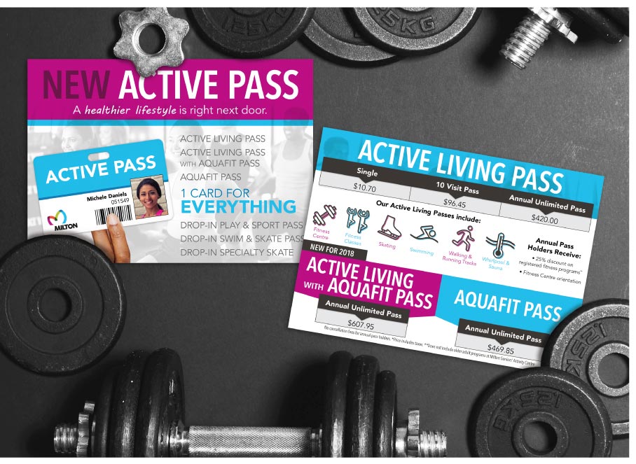
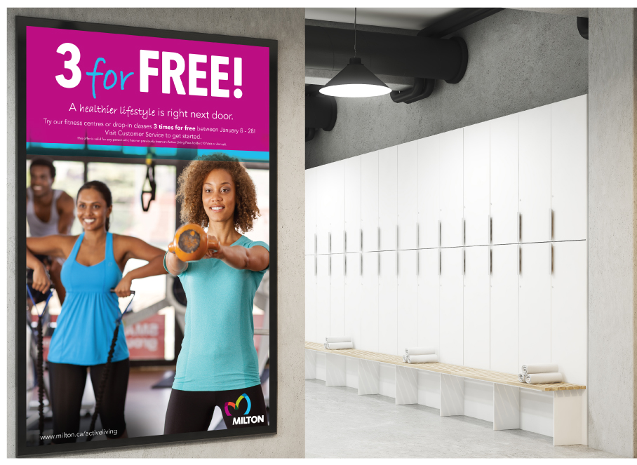
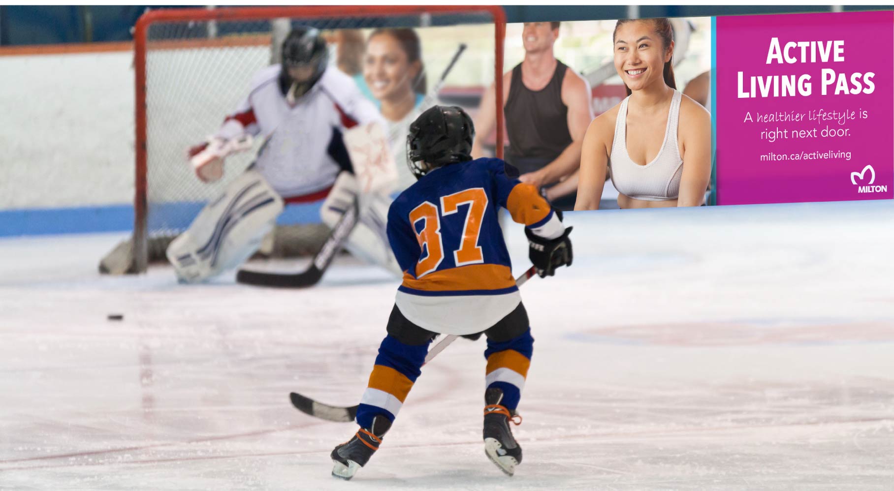
With the launch of the new town brand, Milton was looking to refresh their facility signage and public messaging at its Recreation Centres. The new identity would breathe life into the brand, altering how the community perceived the Recreation Centres. Light filled and airy photography with active subjects depicted individuals from all demographics. The blue and violet of the brand were selected for high-energy ambience. Grey was brought in to anchor the design more subtly than black.
The new visual identity was utilized throughout all collateral to promote unity in facilities, maintaining a similar look and feel throughout various campaigns during the year.